Tutorial - WhatsApp-Style Call Screen
Use this tutorial when you want a small call experience quickly, with MediaSFU handling the room workflow while you simplify the visible UI.
Outcome
By the end, you will have:
- a production-safe create and join boundary
- a minimal call shell that stays close to MediaSFU room behavior
- a first customization layer using UI override hooks
Visual target
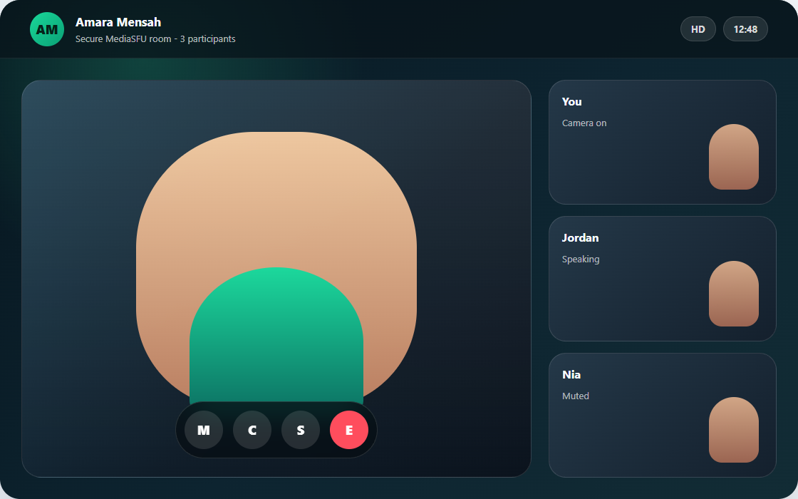
Use this as the first layout target: one dominant participant surface, compact secondary cards, and a bottom control cluster. Keep the secure room workflow and device handling in MediaSFU while you reshape the visible call surface.
Scope and assumptions
This tutorial is intentionally beginner-first:
- start with one framework SDK and keep the default runtime
- use a backend proxy for create and join
- customize only a few surfaces first
Read this before starting:
Step 1: Pick your framework baseline
Choose one:
Do not customize layout yet. Prove default join and leave flow first.
Step 2: Enforce secure backend create and join
Implement backend endpoints first, then route your SDK create and join hooks to those endpoints.
Reference:
Minimum requirement:
- frontend never sends raw MediaSFU credentials
- backend owns forwarding to MediaSFU Cloud or MediaSFU Open
Step 3: Start from a compact call shell
For a WhatsApp-style feel, simplify visible surfaces first:
- compact prejoin
- one dominant active card
- smaller participant strip
- compact bottom controls
Keep MediaSFU runtime and room state intact while you reshape presentation.
Step 4: Add your first overrides
Start with the lightest hooks and avoid full shell replacement on day one.
Typical first overrides:
customVideoCardcustomAudioCardcustomMiniCard- selected entries in
uiOverrides
Move to Custom component replacement only if the room shell itself becomes the blocker.
Two valid angles for the same product shape
This tutorial's main implementation uses returnUI={true}, but the same WhatsApp-style call idea also works headless.
| Angle | What you keep | Use it when |
|---|---|---|
returnUI={true} | MediaSFU room flow plus lightweight card and shell overrides | You want the fastest path to a compact call experience without rebuilding the room shell. |
returnUI={false} | Your own call shell driven by sourceParameters and updateSourceParameters | You want every visible surface, control row, and layout decision to be app-owned from the start. |
Headless angle for this same tutorial shape:
<>
  <MediasfuGeneric
    connectMediaSFU={true}
    returnUI={false}
    noUIPreJoinOptions={noUIPreJoinOptions}
    sourceParameters={sourceParameters}
    updateSourceParameters={setSourceParameters}
    createMediaSFURoom={createMediaSFURoom}
    joinMediaSFURoom={joinMediaSFURoom}
  />
  <CompactCallShell parameters={sourceParameters} />
</>
The true path is better when you mainly want compact presentation. The false path is better when the product depends on a fully custom call shell, navigation, or layout choreography. Use Tutorial - Support AI Console as the closest headless reference.
Copy/paste starter: compact React call screen
Drop this into a React app after installing mediasfu-reactjs. It gives you a compact call-style room using the normal MediaSFU room workflow, a secure backend proxy, and lightweight card overrides.
Create src/WhatsAppStyleCallScreen.tsx, paste the component below, and keep your backend /api/mediasfu/create-room and /api/mediasfu/join-room routes forwarding to the same upstream MediaSFU Cloud rooms URL from Secure backend proxy.
import { useMemo, useState } from 'react';
import {
  MediasfuGeneric,
  MiniCard,
  VideoCard,
  type CreateMediaSFURoomOptions,
  type CustomMiniCardType,
  type CustomVideoCardType,
  type JoinMediaSFURoomOptions,
} from 'mediasfu-reactjs';

type RoomResult = {
  data: Record<string, unknown> | null;
  success: boolean;
};

async function createMediaSFURoom({ payload }: { payload: CreateMediaSFURoomOptions }): Promise<RoomResult> {
  const response = await fetch('/api/mediasfu/create-room', {
    method: 'POST',
    headers: { 'Content-Type': 'application/json' },
    body: JSON.stringify(payload),
  });

  return { data: await response.json(), success: response.ok };
}

async function joinMediaSFURoom({ payload }: { payload: JoinMediaSFURoomOptions }): Promise<RoomResult> {
  const response = await fetch('/api/mediasfu/join-room', {
    method: 'POST',
    headers: { 'Content-Type': 'application/json' },
    body: JSON.stringify(payload),
  });

  return { data: await response.json(), success: response.ok };
}

const CompactVideoCard: CustomVideoCardType = (props) => (
  <VideoCard
    {...props}
    customStyle={{
      borderRadius: 24,
      border: '2px solid #25d366',
      overflow: 'hidden',
      backgroundColor: '#07130d',
      ...(props.customStyle ?? {}),
    }}
  />
);

const CompactMiniCard: CustomMiniCardType = (props) => (
  <MiniCard
    {...props}
    customStyle={{
      borderRadius: 18,
      border: '1px solid rgba(37, 211, 102, 0.45)',
      background: '#07130d',
      color: '#e7fff0',
      ...(props.customStyle ?? {}),
    }}
  />
);

export function WhatsAppStyleCallScreen() {
  const [sourceParameters, setSourceParameters] = useState<Record<string, unknown>>({});

  const noUIPreJoinOptions = useMemo(
    () => ({
      action: 'create',
      eventType: 'conference',
      userName: 'Host',
      capacity: 4,
      duration: 30,
    }),
    []
  );

  return (
    <div style={{ minHeight: '100vh', background: '#03140d' }}>
      <MediasfuGeneric
        connectMediaSFU={true}
        returnUI={true}
        noUIPreJoinOptions={noUIPreJoinOptions}
        sourceParameters={sourceParameters}
        updateSourceParameters={setSourceParameters}
        createMediaSFURoom={createMediaSFURoom}
        joinMediaSFURoom={joinMediaSFURoom}
        customVideoCard={CompactVideoCard}
        customMiniCard={CompactMiniCard}
        containerStyle={{ background: '#03140d' }}
      />
    </div>
  );
}
Render it from your app entry:
import { WhatsAppStyleCallScreen } from './WhatsAppStyleCallScreen';

export default function App() {
  return <WhatsAppStyleCallScreen />;
}
What you should see first:
- the normal MediaSFU room flow
- compact green-accented video and mini cards
- create and join requests going through your backend endpoints
Use Storybook visual preview when you want to inspect the ReactJS display-card stories before pushing these card-level changes into your app.
Step 5: Wire practical actions in your shell
Keep the call experience focused:
- join or create room
- toggle camera and mic
- optional screen share
- leave room
These actions should remain mapped to MediaSFU workflow helpers, even if the UI is fully branded.
If you later replace the whole shell with customComponent, call helpers with the parameters wrapper:
function CompactControls({ parameters }: { parameters: any }) {
  return (
    <div style={{ display: 'flex', gap: 12 }}>
      <button onClick={() => parameters.clickAudio?.({ parameters })}>Mic</button>
      <button onClick={() => parameters.clickVideo?.({ parameters })}>Camera</button>
      <button onClick={() => parameters.clickScreenShare?.({ parameters })}>Screen</button>
    </div>
  );
}
This snippet shows the lowest-level wiring only. In customComponent, parameters is the same live helper bundle described in Media lifecycle. Use raw calls like clickAudio, clickVideo, and clickScreenShare for simple toggles, but do not assume every control surface has to be rebuilt this way.
If you add recording or other modal-heavy flows later, prefer importing RecordingModal or ModernRecordingModal, or restyling uiOverrides.recordingModal, instead of recreating the full flow with only ad hoc buttons. Read Custom component replacement and UI overrides before expanding the control bar.
Step 6: Production checklist
- secure backend is mandatory
- device permission behavior is validated on target devices
- failure states are visible in the UI
- join and reconnect behavior tested with poor network
- role and permissions behavior tested for host and participant paths
What to build next
After this tutorial is stable:
- Add media-state indicators and participant presence cues.
- Add recording and moderation controls if needed.
- Move to Tutorial - Twitch-Style Host Dashboard if your product grows into a host workspace.